
Théo Sourget
Sunday, September 13, 2026
Dataset Diversity Metrics and Impact on Classification Models
Diversity is commonly viewed as a good and important feature for a dataset, as a large and diverse dataset should lead to better results and generalization. However, while datasets are often claimed to be diverse, what “diverse” is, is not clearly defined and may change from paper to paper. It could, for example, refer to the demographics of the patients, the scanner being used, the annotators, etc.
There are some metrics to quantitatively measure the diversity of a set, they are however mostly used in a generative context such as image generation or answers from LLMs. Their usage on real datasets and their correlation with a downstream performance task is therefore unclear. Finally, while datasets are increasingly multimodal, for example containing chest X-rays and radiology reports with metadata, most studies only assess the diversity of a single modality for a dataset.
In our work “Dataset Diversity Metrics and Impact on Classification Models”, we study the behavior and correlation of existing metrics across different modalities. We also evaluate the correlation with classification performance. Finally, we conducted a semi-structured interview with a clinical expert to gather his views on diversity in practice.
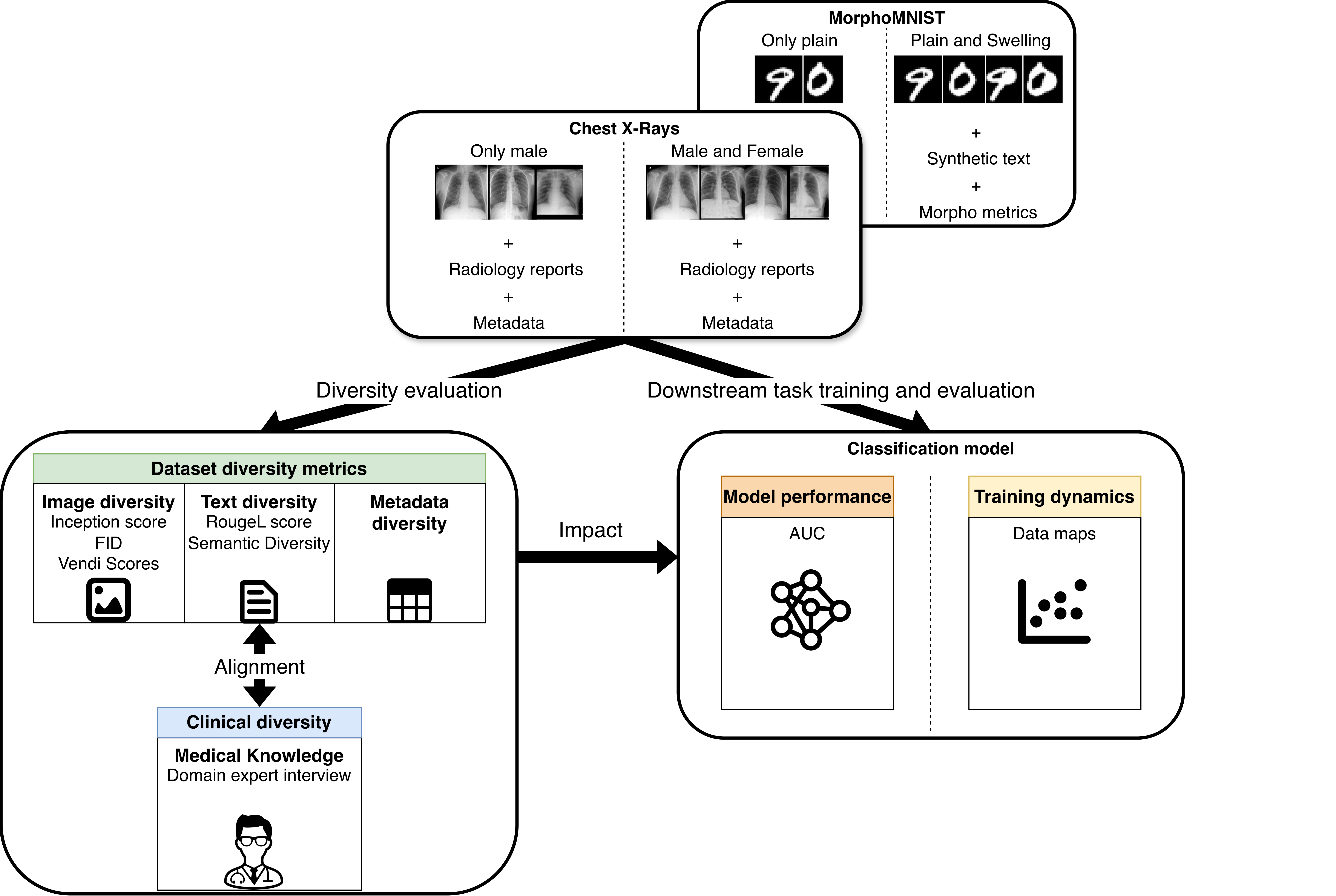
Datasets used in this work
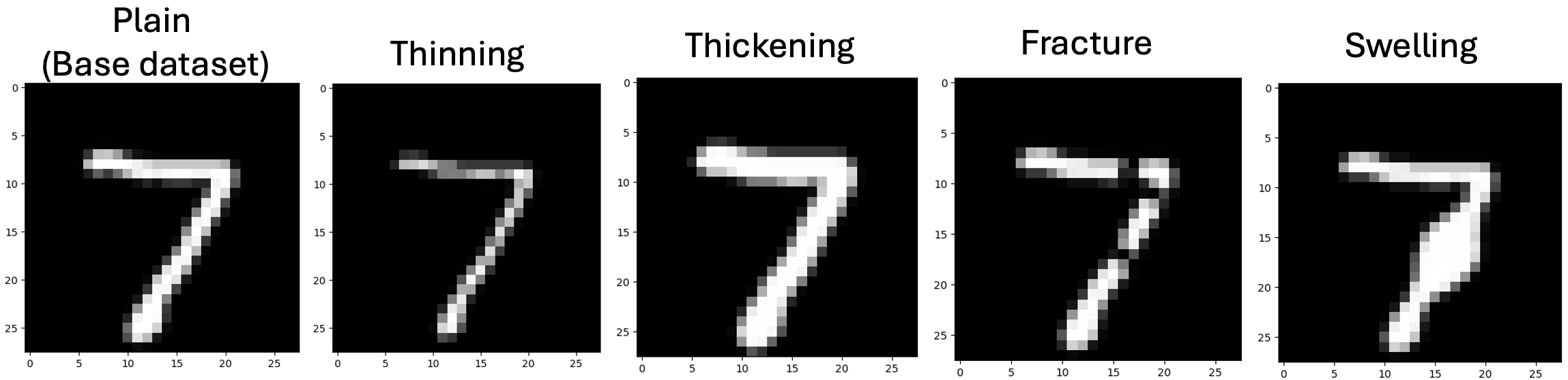
In our experiments, we used two publicly available datasets, the first one, to have better control over diversity, is MorphoMNIST. MorphoMNIST is a framework around the MNIST digit classification dataset to add some perturbation to the images. The perturbation can be global, like the thinning and thickening ones, or more local, like the Fracture and Swelling. In addition to the image, we generate a synthetic text using a template, with the number in the image and the perturbation applied. Finally, the morphoMNIST framework also computes some metrics on the digit, such as the height and width, that we use as metadata.
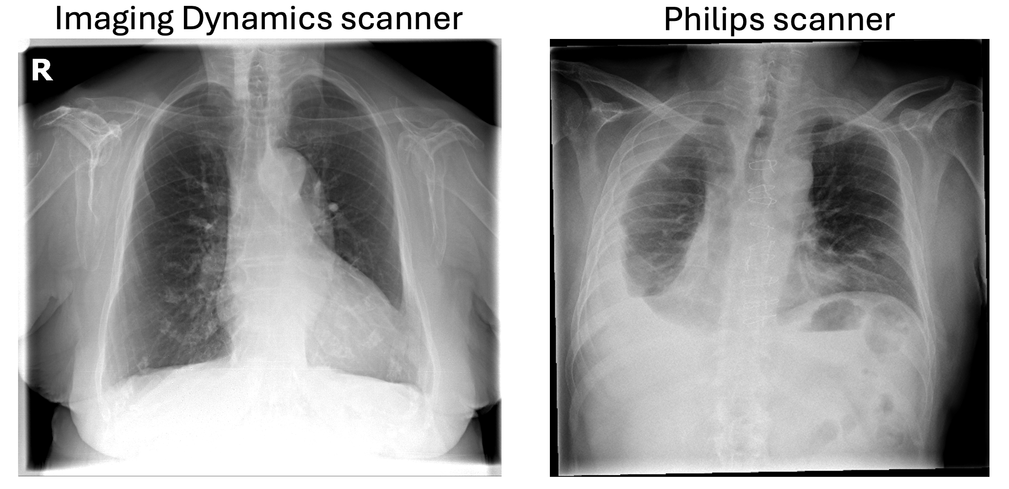
The other dataset, and the one I will focus on in this post, is the PadChest dataset containing chest X-rays, radiology reports, and metadata. As you can see below, the images are acquired using two different scanners, which will be important in a later part. The available radiology reports are written in Spanish, and for the metadata, we use age, sex, projection, and scanner. While the dataset provides labels for multiple diseases, we focus on binary classification of pneumothorax in our study.
We divided the images into different subgroups: for MorphoMNIST based on their perturbation, and for PadChest based on the patient’s sex or the acquisition scanner. We then created a fixed test set that contains all types of images and multiple training sets where we either include or exclude certain subgroups. For instance, a set only containing images from the Philips scanner.
Diversity Metrics Evaluation
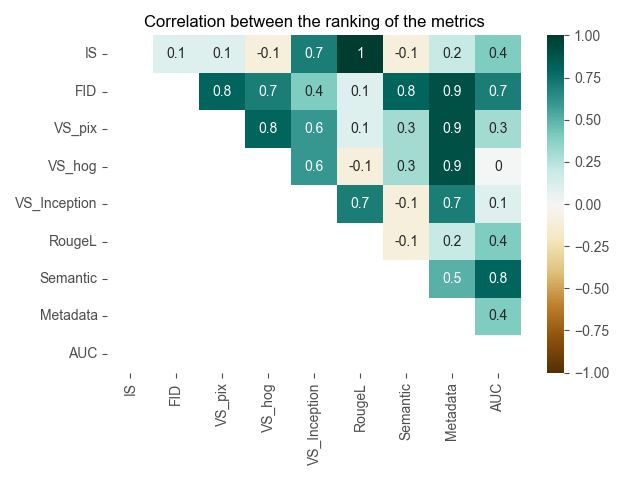
Our experiments are then divided into two categories, the first about diversity metrics evaluation. For each training set, we computed its diversity using metrics for different modalities; I won’t go into details of all metrics in this post, but for the image diversity, we used the Inception score, the Fréchet Inception Distance (FID), and three different Vendi Scores with different similarity functions. For the text, we used the RougeL and what we named Semantic similarity, which is the cosine similarity of a text embedding. For the metadata, we also used the cosine similarity. It is important to mention that the FID is different from the rest as it requires a reference set to be computed. In our case, the test set is also being used as a reference. Finally, we also trained a ResNet-50 model for each training set and computed the AUC on the test set for each as our performance metric. For each metric, we can then compute the rank of each training set and compute their correlation using the Spearman’s rank correlation.
Here are the results for the diversity metrics for the PadChest dataset. I will mainly talk about our main interest, which is the correlation with the downstream task performance in the last column of our correlation matrix. First, we can see that most metrics do not correlate well with the AUC, with a correlation below 0.4. Two metrics stand out with a good correlation: the FID and the Semantic diversity. For the semantic diversity, while the correlation of the ranking is high, when looking at the actual values we notice that the range for all sets is very small. For the FID, while this is also well correlated with the AUC, it comes with the drawback of needing the reference set.
Training Dynamic and Shortcut
Then for the second part of our experiments, we also looked at the training dynamics using data maps. Data map is a technique coming from NLP where, during training, we look at the evolution of the probabilities for each sample. In our study, we were interested in how the diversity of the training set would impact the learning of the different subgroups. Therefore, after each training epoch, we computed the probability of the correct class for each sample in the test set as it contains all types of images. We can obtain the mean and standard deviation for each sample and plot them on a data map where, based on the location, we can see if the learning for a patient was fast or slow and correc or not.
We looked at the data maps for subgroups based on patient sex and the scanners. We observed some differences based on the acquisition scanners but not for patient sex, so I will now focus on the scanner results.
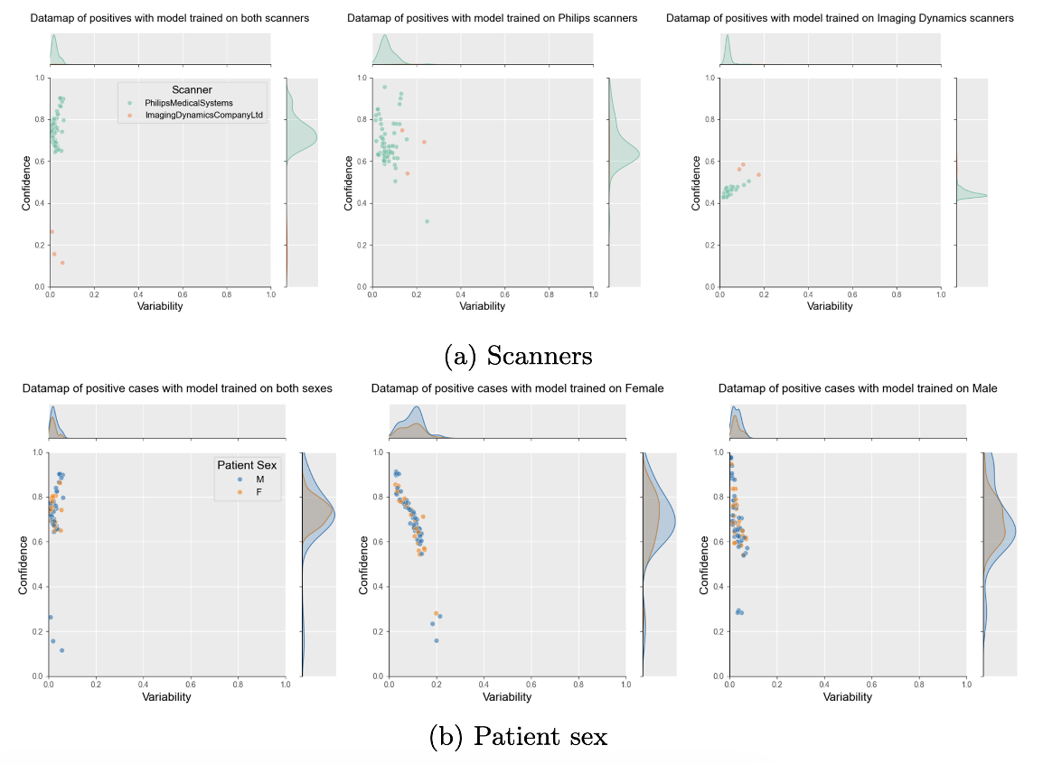
In these maps, each point is a patient. The higher it is, the more confident in the correct class the model is. The further to the left it is, the more stable the probability is during training. A point at the top left is a sample that is quickly correct, and on the bottom left, quickly incorrect. Here I show two data maps for positive samples of pneumothorax: on the left, the one for the model trained with images from both scanners, and on the right, the one trained only on images from the Philips scanner, which has many more positive samples compared to the other scanner. In the first map, we can see that the samples from ImagingDynamics have a low probability. On the other hand, for the model trained with only images from the Philips scanner, we can see that the same samples from ImagingDynamics obtain a much higher probability. This shows, first, that having more images in your training set is not always better, as it can lead to shortcut learning. Secondly, Data Maps can help detect such shortcuts.
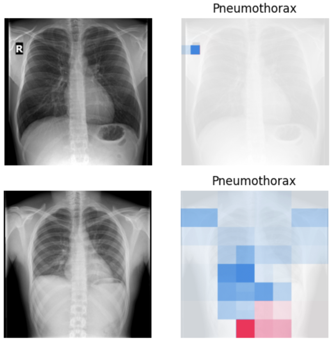
We investigated this potential shortcut further by generating explainability maps using SHAP for the models trained on both scanners and saw that for an image from the Imaging Dynamics scanner, the model actually focuses on the R label on the top left, and for the Philips scanner, it seems to focus on a more central part of the image, which could be more logical but would require more investigation.
Clinician Interview
To conclude, I will present the main takeaways from our interview with a radiology resident. To conduct the interview, we asked some leading questions with follow-up questions if needed. When asked about the main factor for diversity in practice, the answer was the acquisition scanner, as multiple scanners will have different processing algorithms. We also asked about patient demographics, but they are mostly used as statistical guidance in case two diseases have similar findings but one is more prevalent in the patient population. Finally, disease severity is not as important as in other modalities because chest X-rays are not as precise.
Related Links
Read the full paper: https://openreview.net/forum?id=OMwWpdPVYW
Check the source code: https://github.com/TheoSourget/dataset_diversity_evaluation
See other studies from PURRlab: https://purrlab.github.io/